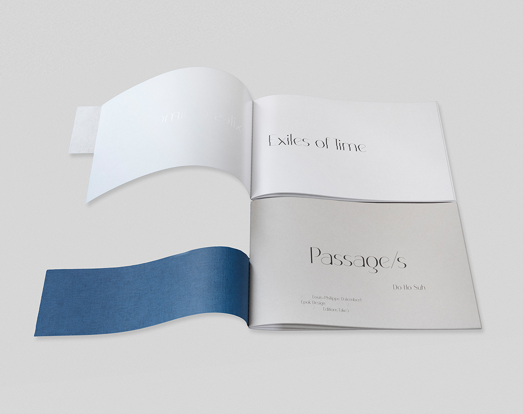
Passage/s
An artists’ book created by Do Ho Suh and éditions Take5Published in 2022 by éditions Take5, Geneva,
under the editorial direction of Céline Fribourg and Amie Corry
Artwork by Do Ho Suh, luminous cardboard architecture
with cutouts and folding
Additional Design by Nicola Chan
Book stand designed by Adrien Rovero,
in collaboration with Do Ho Suh and Céline Fribourg
Text by Louis-Philippe Dalembert, specially written in French for the book,
translated into English by Aurélie Levy and edited by Amie Corry
Graphic Design by Marine Langenegger and Emanuele Fiori
for Epok Design Studio, in collaboration with the publisher
Printed on Takeo papers
An edition of thirty, numbered and signed by the artist.
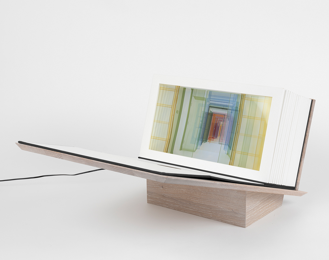
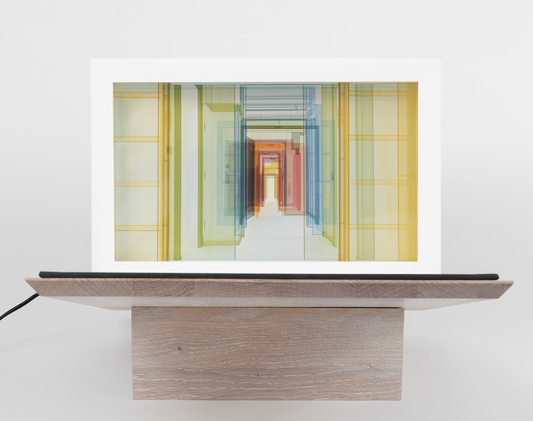
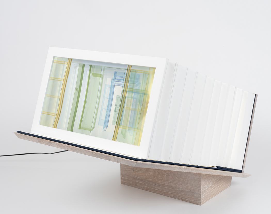
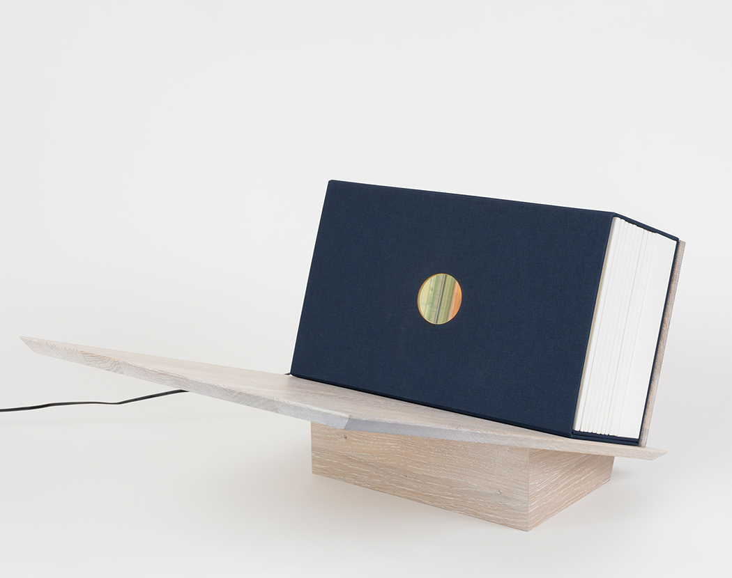
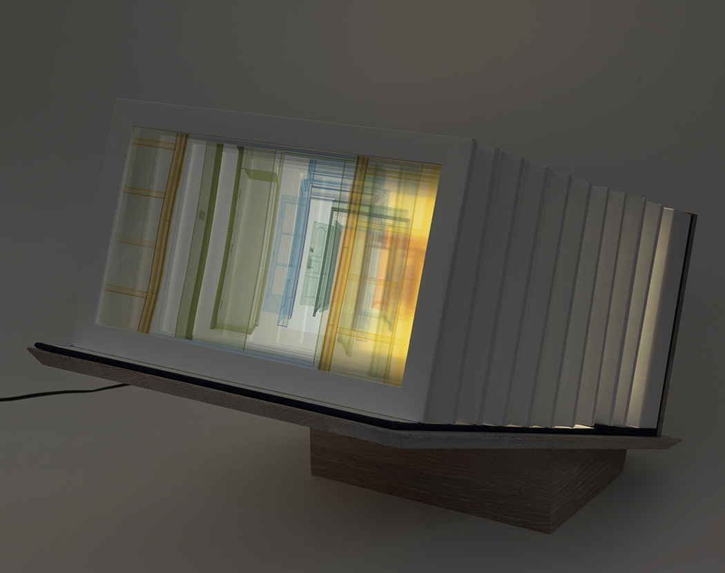
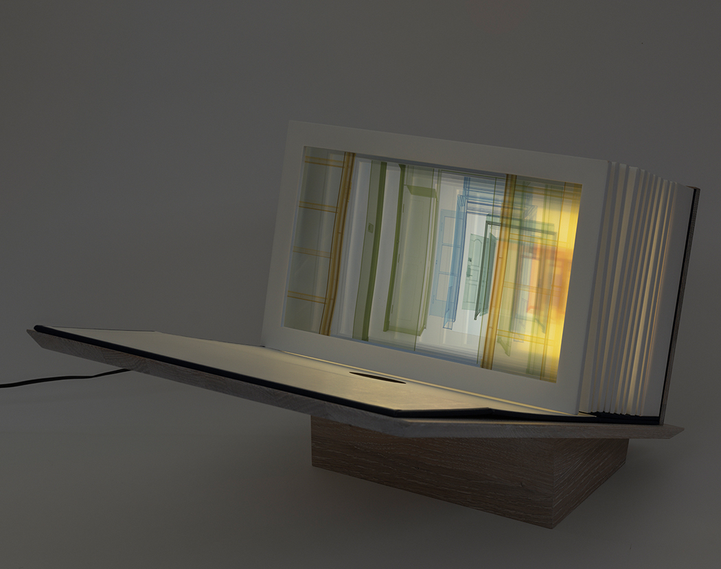
This ‘paper peepshow’ created by South Korean-born artist Do Ho Suh evokes a luminous and poetic miniature theater, which invites the viewer to encounter a succession of architectural drawings. Each cutaway represents the threshold of one of the artist’s seminal Hub sculptures – one-to-one scale fabric recreations of transitional spaces within his past and present homes. Translucent corridors, passages, nooks and hallways are brought together, prompting reflection on the ephemerality of life and the subjectivity of time and memory.
These transitory, connecting spaces, speak metaphorically of movement between cultures and the blurring of public and private. On an intimate level, they embody the artist’s metaphysical reflections on life, as well as his transnational existence: “I see life as a passageway, with no fixed beginning or destination,” says Suh. “We tend to focus on the destination all the time and forget about the in-between spaces. But without these mundane spaces that nobody really pays attention to, these grey areas, one cannot get from point A to point B.”
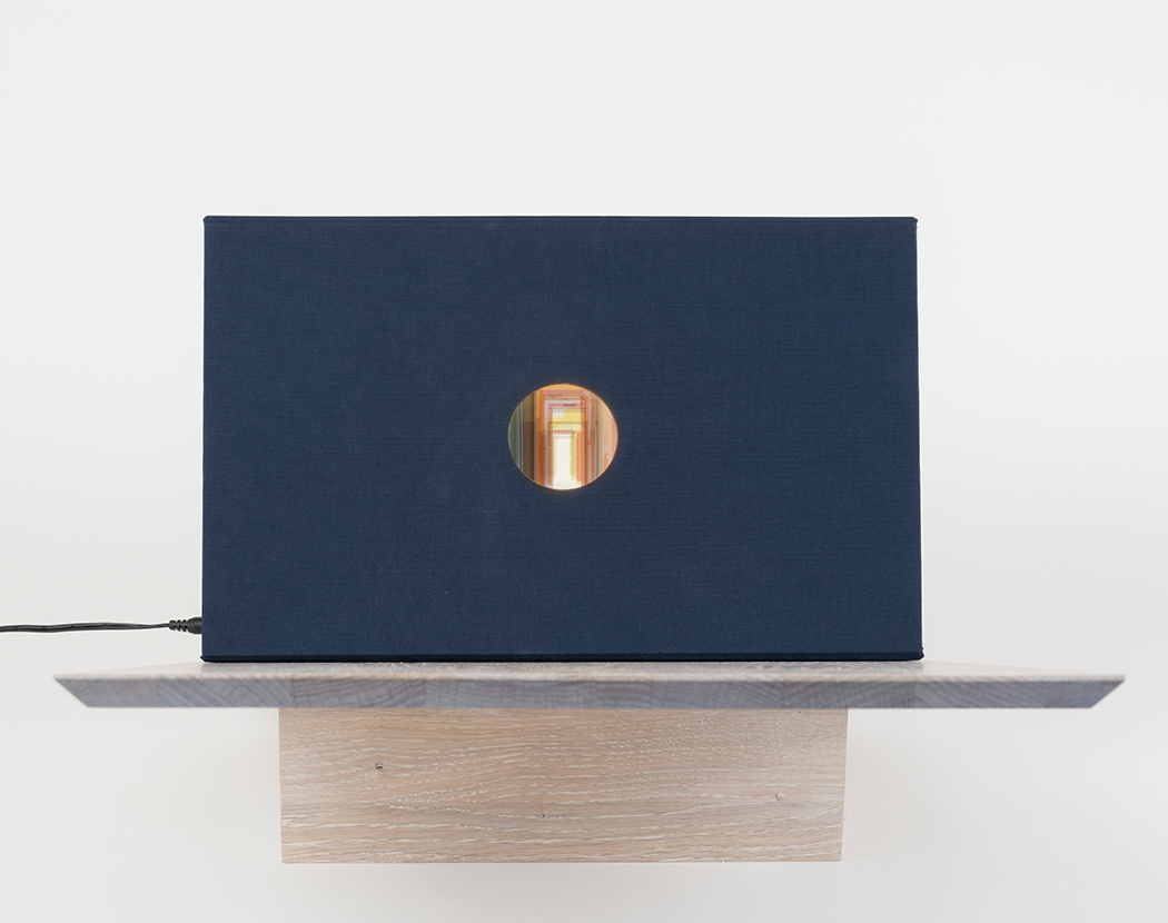
Passage/s unfolds like an accordion. When it is closed within its clothbound casing, the succession of Hubs can only be perceived through a hole, in reference to the photographic lens of a camera, and the history of peepshows, which were popularized in the eighteenth and nineteenth centuries. The movement of opening and closing the book recalls early photographic equipment, as well as the importance of movement to Suh’s practice, in which architectural installations are ‘activated’ by the viewer.
This symbolic organization of space in relation to memory, highlights the link between thought and image and reminds of the loci method. This mnemonic method, practiced since Antiquity and likely invented by the poet Simonides of Ceos, was described by Cicero (De Oratore) and Quintilian. Loci – in which spaces are visualized in order to prompt memory recall – privileges the imaginary landscape and the inscriptions of humankind on this landscape. It also places emphasis on the notion of wandering, through which memories might be brought forth as images are virtually applied to architecture.
Paper peepshows were originally produced as portable versions of the large, optical devices that travelled around countries in Europe as a means of bringing a spatial experience to an audience. Suh’s practice is deeply invested in the idea of transportable space – his Fabric Architecture sculptures can be packed down into suitcases – as a necessary survival method for a peripatetic life.
In ‘Exiles of Time’, commissioned to accompany the artist’s book, Haitian writer Louis- Philippe Dalembert explores notions of freedom, exile, and uprooting, and elaborates on the concept of “land-time”. Responding to the themes of Suh’s practice, Dalembert exposes our inclination to recreate an idealised image of our countries of origin, mentally and emotionally preserving an attachment to the experience of childhood.
The design of the booklet mirrors the sensation of being uprooted. French graphic designers, Epok studio, created an original typography, which evokes the feeling of displacement in the face of exile and change: downstrokes and upstrokes suggesting the passage of time, an aerial sans serif font, which retains a pleasing childlike quality in the gentle roundness of its letters. The chapter titles transform over the course of the pages: the lower half of the letters shifting to the right at increasing increments, giving form to the discombobulating feeling of being ‘split in two’, torn between country of origin and country of adoption. This gap between the upper and lower parts of the letters illustrates how ambitions to take refuge in the past cannot always succeed – we can never return to the same place and time.
The bibliographical notes are deliberately placed in front of the group of words to which they relate, and not at the bottom of the page as tradition presides. They upset the conventional unfolding of the text to echo the disruption created by displacement.
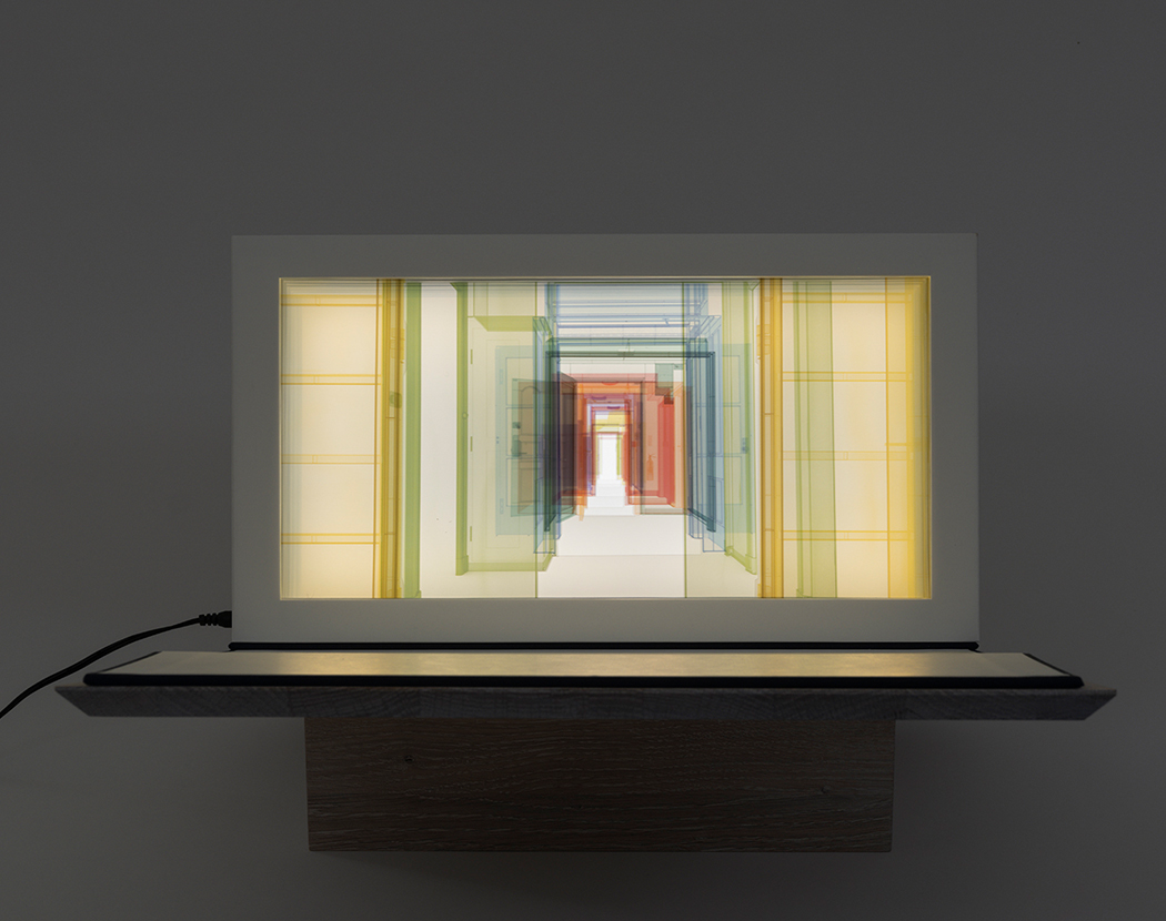
The stand, created by Swiss designer Adrien Rovero, supports the book on a hinged surface, allowing the viewer’s gaze to dive directly into the sequence of Hubs. Crafted by a Swiss wood master in solid oak and delicately coloured using white oil, its pure form evokes migratory birds.
 FR
FR