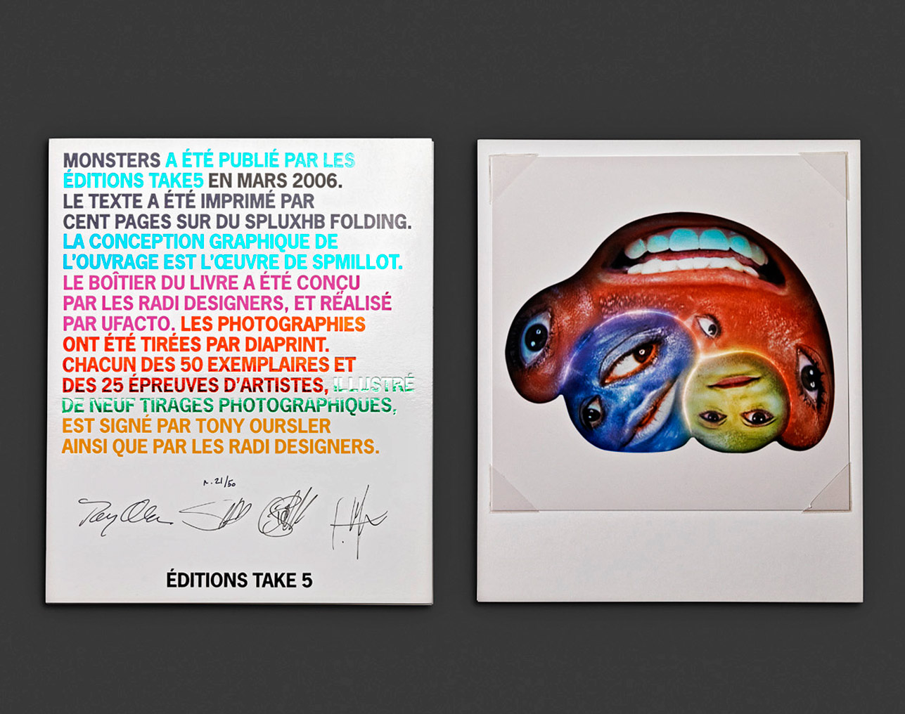
MONSTERS
Artists' book published in 2005 by Editions Take5 (Geneva).9 original signed photographs and a text specially written
in English for the book by Tony Oursler
Soundtrack (remix from noises transmitted
by the NASA) created by the artist, and recorded on a CD
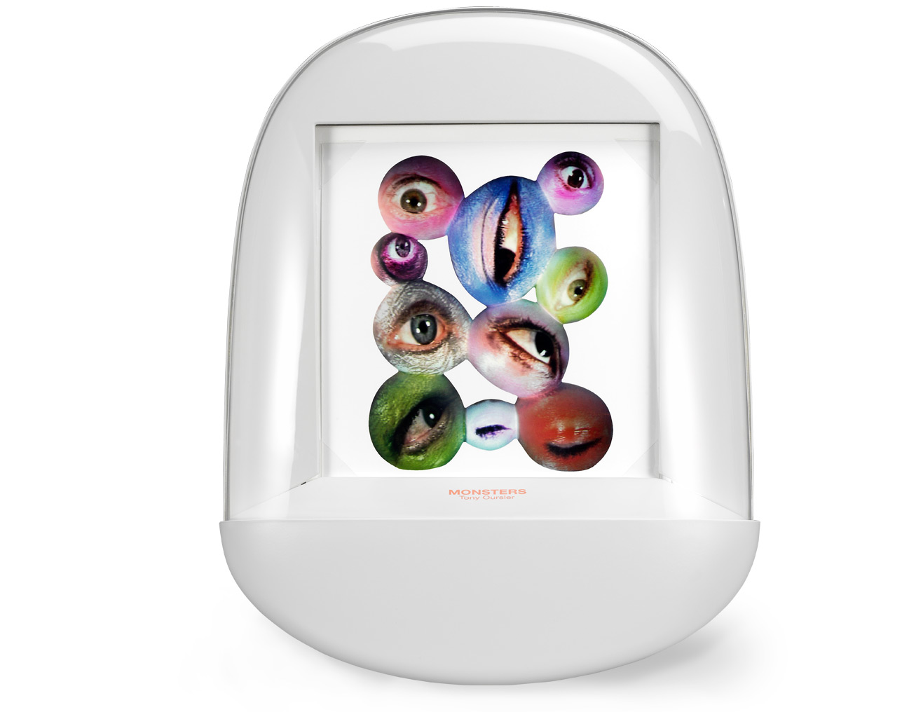
Tumbling tray case designed by Radi Designers,
made of a white-resin base covered by a transparent globe
Graphic design by Philippe Millot
Each copy is numbered and signed by
Tony Oursler and Radi Designers
An edition of 50 copies - Dimension: 17.8 x 13.8 x 2 inches
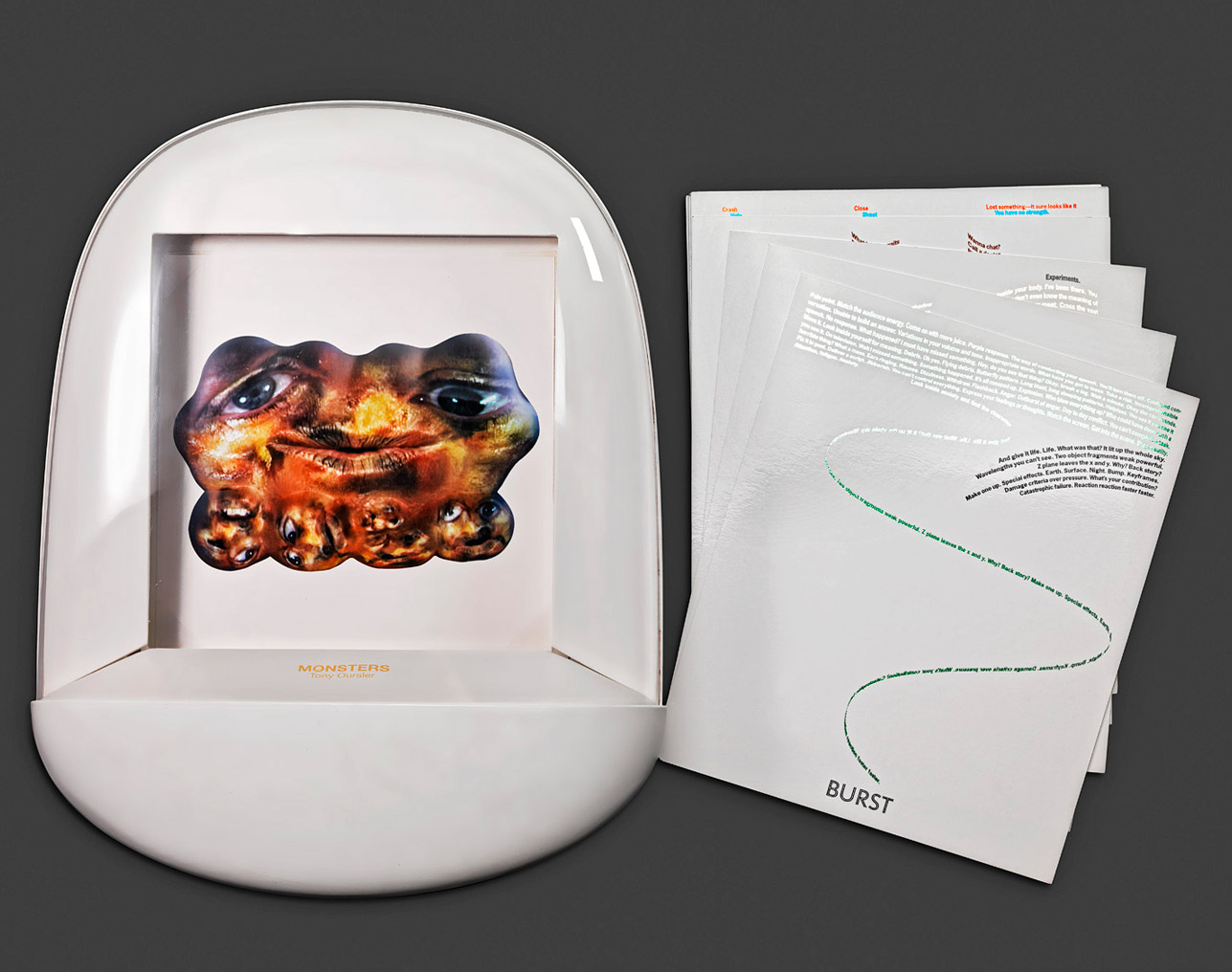
Monsters, Tony Oursler’s first artist’sbook, features a chaotic discussion between spooky,scary, and funny characters. Tony Oursler was eager topay tribute to his creatures through the medium of thebook. For him it was important to leave a more lastingtrace of their passage, which is somehow ephemeral inhis videos.
The artist’s futuristic photographs, saturated with colors,are portraits of the characters that are staged inhis videos. Each of these monsters, remnants of humanbeings, has a strong presence and a coherent discoursedespite its apparent incoherence. For the artist, it wasimportant to put down on paper the idiosyncrasiesof these composite beings, whose mumbling is some-times not heard in its integrity during the screenings.Coming from a family of writers, Tony Oursler hasalways wanted to capture in writing the voices of hischaracters.
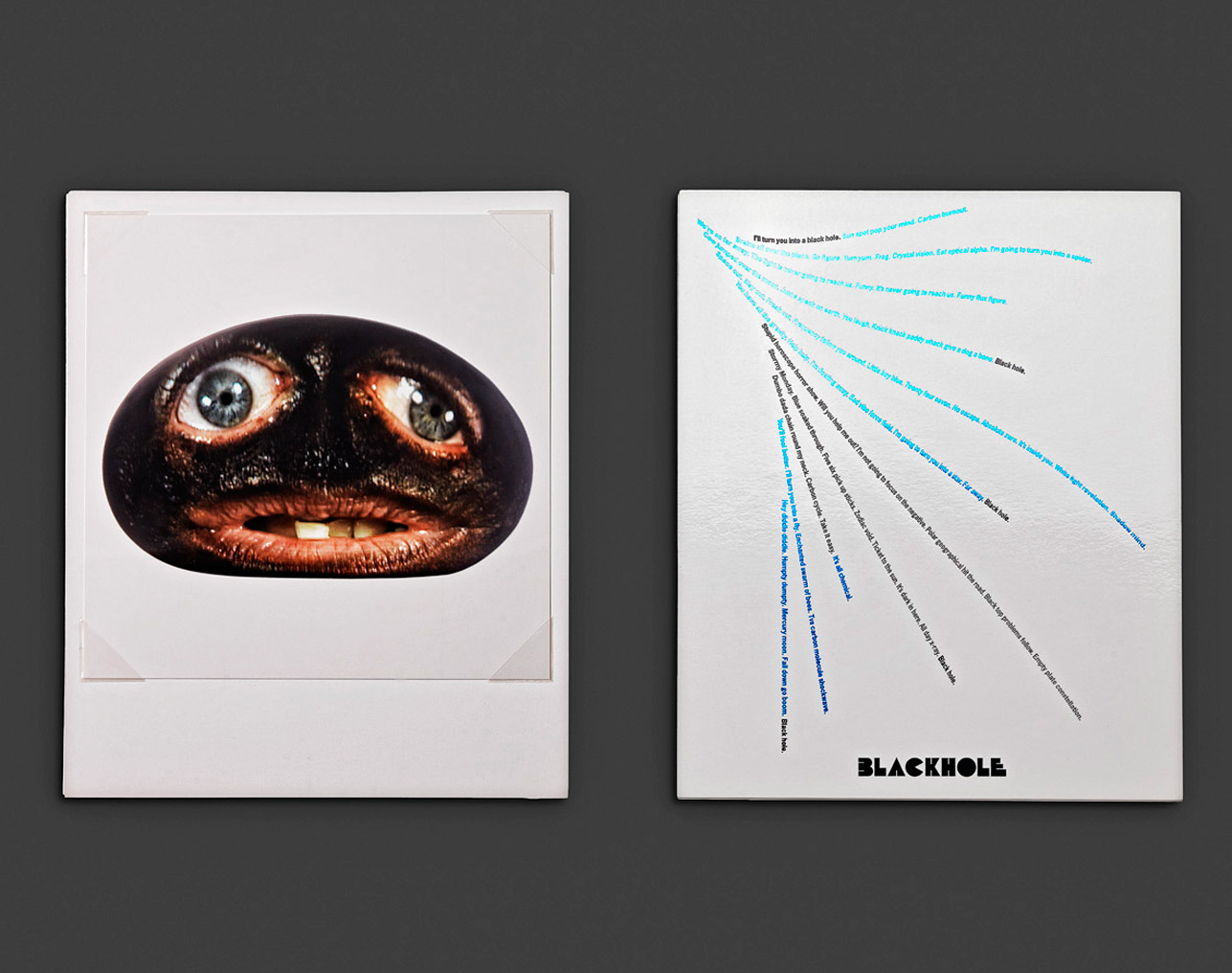
These voices fuse without answering one another, as ifthey were monologues rehashed ad infinitum. Beyondtheir strange, comical appearances, the monsters showthe narrowing of consciousness and the depth ofhuman preoccupations. In a touching and surprisingmanner, they expose neuroses, anxiety, claustrophobia,and excruciating loneliness.
Making an artist’s book with a video artist was a realchallenge on different levels. Recreating the movementof the video, without using any kind of artificialdevice, was already a challenge for the graphicdesigner Philippe Millot. Millot made use of ingenioustechniques–from the layout of the text to the choice ofink–in order to introduce motion throughout the book.In the tradition of calligrames dear to Rabelais andApollinaire, the text runs across the pages in tantalizingand sensual spreads, giving free rein to the imagination.The use of colorful metallic ink invites the lightto reflect on the typeface as if the words were dancing,adding to the impression of movement.
Each monster has its own personality, and each monologueis transcribed with a different font.
The silver edges of the pages perpetuate this idea ofmovement of light with the rocking of the tray case,which seems to comes to life in an oscillating motion.For the housing of the book, Radi Designers came upwith a clever idea, inspired by a 21st-century cabinetof curiosities, a transparent and futuristic containerrocking like a roly-poly toy. Like a jar filled with formaldehyde,it confines the monsters and symbolizes thefeeling of entrapment that at times characterizes thehuman condition. It also allows a possible ethnographicstudy of these characters, who lead intense lives. Theircapacity for auto-analysis is a creative soil, and theirrevealed fragility makes them endearing. The rockingof the roly-poly tray case set these intriguing creaturesin motion, who seem to come alive inside book.
 FR
FR