RECTO VERSO
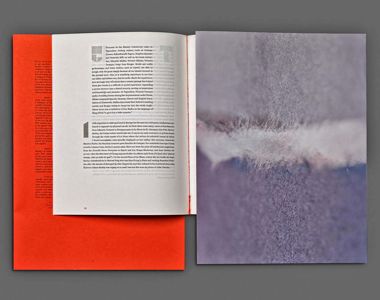
Artists' book published in 2012 by Editions Take5 (Geneva).Text specially written for the book in English by Alberto Manguel,
translated into French by Christine Le Boeuf
All the photographs have been commissioned and specially taken
by Ali Kazma for the book :
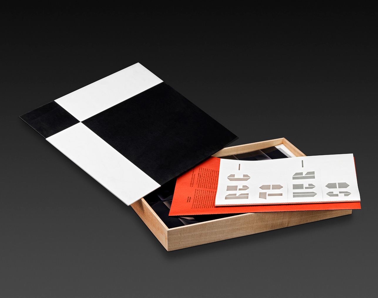
- 8 original signed color prints
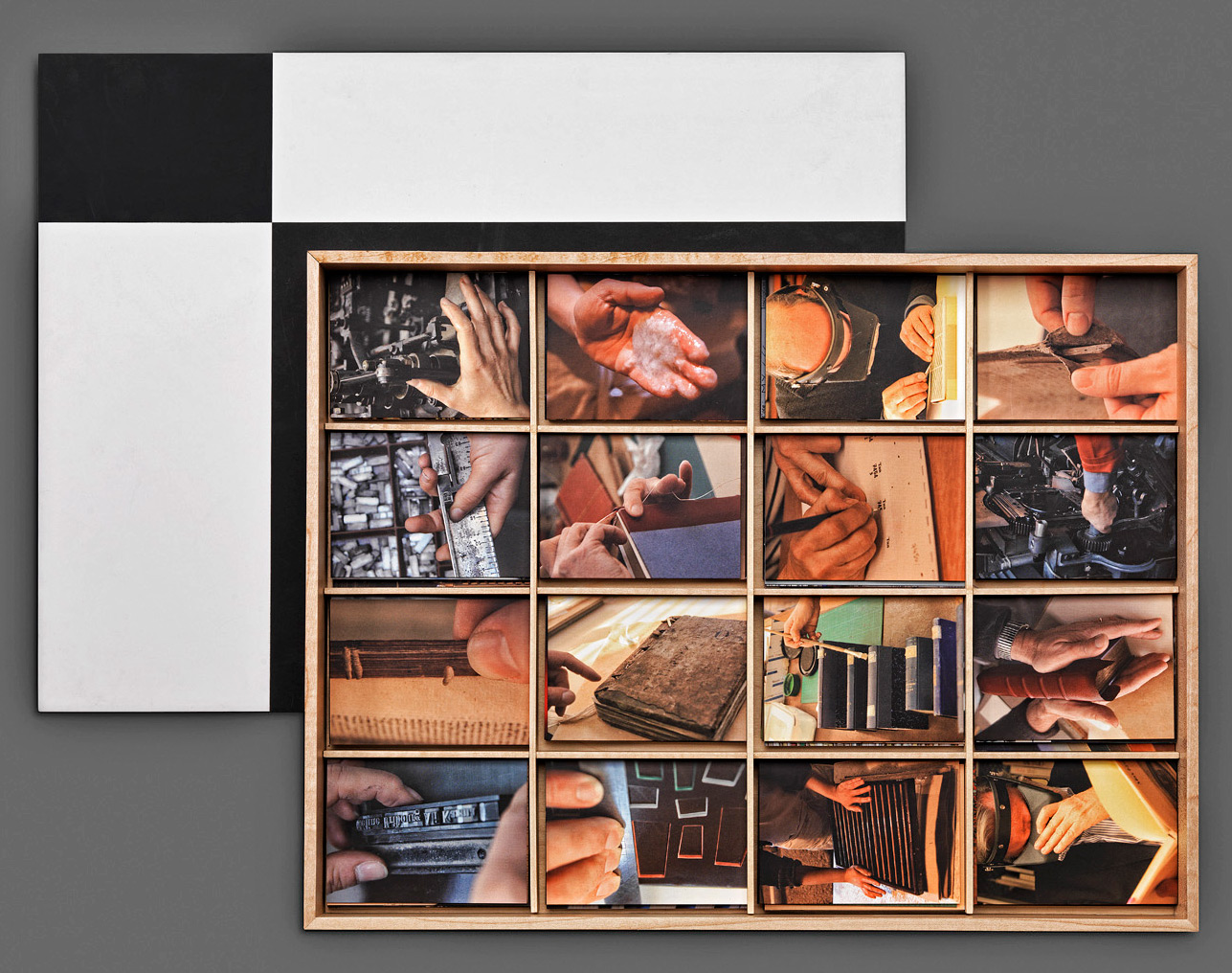
- 176 photographs printed with offset on cardboard
The graphic design is the work of Philippe Apeloig,
in collaboration with the artist and the publisher.
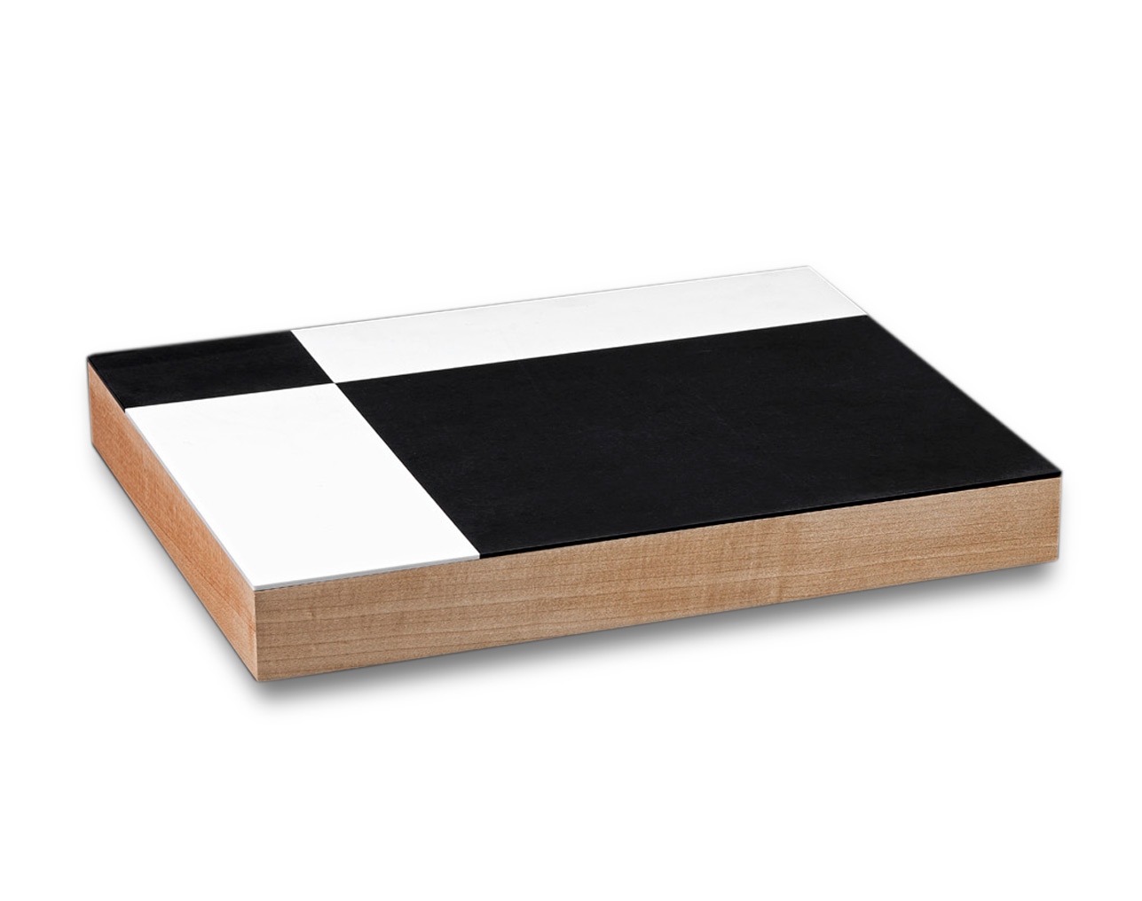
Jean-Luc Honegger imagined a geometrical design for the cover of the tray case,
executed by hand in polymethylmethacrylate and closing a maple wood box
Each copy is signed by Ali Kazma, Alberto Manguel, Philippe Apeloig,
and Jean-Luc Honegger
An edition of 30 copies - 17 x 13 x 2 inches
In Recto Verso, a dialogue between the photographs of Turkish artist-videographer Ali Kazma and the text by Canadian author Alberto Manguel instigates a reflection on the book and its future. For several years, Editions Take5 had wanted to undertake a project in honor of the book–which presented a real challenge, both because of the complexity of the subject and the transformations this medium has undergone over the centuries. In the end, the choice fell on Ali Kazma to make an artist’s book on the subject: he is passionate about the book, and each of his videos is a true archaeological, aesthetic, and poetic documentary on the knowledge and gestures that characterize a profession.
For years the artist has examined the role played by the trades in our societies, observing their mode of operation so as to approach the topic of work in a philosophical way.
“In his videos, Ali Kazma demonstrates a strong predilection for close attention and patient observation. His works bide their time– taking a closer look, in a descriptive but also an analytical manner–through precise filming that testifies to a pleasure in detail. The resulting image, exceeding the framework of the documentary, is elevated to the level of a cognitive vector. It shows without dramatizing, and clarifies without taking sides.”
Over a period of three years, the editor travelled the roads of Europe together with the artist, visiting numerous emblematic locations that are rarely accessible to the public–libraries, printing shops, papermakers, bookbinders, restoration workshops, book lover’s dens–a true photographic investigation. With the broad scope of the project, the number of photographs grew from week to week. In the end Kazma took almost 8,000 photos. Apart from this archival work, eight original photographic prints were selected by the artist and the editors to illustrate the artist’s book, along with 176 photographs in the form of small cards. Some are descriptive, others purely aesthetic, still others simply funny. Easy to handle, they allow the collector to compose an infinite number of visual stories, similar to the video screens that Kazma juxtaposes in his work. Each one explores the precise gestures carried out by the men and women as they go about their work with books. The artist transcends the systematic and repetitive side of these gestures by revealing their virtuosity and craftsmanship. Also celebrated are first manuscripts, artist’s books, philosophical collections, and treatises that have made a mark on our history. The same emotion and rigor with which the artist communicates his vision of the world of books, their development over time, and endangered masterpieces resonate in the text by Manguel, one of the greatest scholars on the history of the book
Specifically for this project, the author composed a veritable plea in favor of the book, for him a unique and indispensable medium, the last bastion against obscurantism, and guardian of the memory of our societies. Hommage à Babel is a very personal text, drawing on the author’s experiences and historical examples that underscore the importance of the book across eras and civilisations. Citing numerous anecdotes and references, Manguel also highlights the role of the reader, without which the book could not exist on its own. For him, the reader and the book are wholly interdependent. Evoking the evolution of reading technologies, Manguel states that nothing can replace traditional reading, “a practice that grants better than any other a sort of joyful immortality, an illusion of unlimited space and time.” Reading on a screen, by contrast, is “a different activity,… one that takes place in another region of our brain. It borrows the vocabulary of reading because it has not yet found its own.”
Philippe Apeloig was inspired by the documentary aspect of Kazma’s work. Together with the editors, the graphic designer imagined an interactive adventure that allows the reader to freely discover hundreds of trades that play a part in the creation of a book. Apeloig developed an identification code using symbols featured in a manuscript by Borges (Manguel read to Borges at the end of his life, when his sight had deteriorated). These symbols are printed on the back of each card, enabling readers to retrace in a playful and surprising way each step in the production and conservation of a book. The title appears progressively on flaps of different sizes, in varying shades of grey. The layout of the text reflects the fluidity of the reading process, with paragraphs of different sizes positioned according to a random grid, and page numbering that alternates from place to place. The dropped initials, especially designed by Apeloig and inspired by stencils and origami, announce each paragraph like a post-modern fairytale and use a minimum number of lines.
To design the pattern appearing on the case, the Swiss bookbinder Jean-Luc Honegger drew inspiration both from the form of the library, in tribute to Manguel, and from the video screen, in reference to Kazma. The contrast between black and white evokes the duality of every library, which, according to Manguel, is well ordered during the day and undergoes a metamorphosis at night, when the most iconoclastic works have their say. It also brings to mind the struggle between the light of knowledge and the darkness of obscurantism. Used to working with leather to make unique bindings for collector’s editions, Honegger agreed to experiment for Editions Take5 and to work with a contemporary material, PPMA, which the editor associates with maple wood.
 FR
FR